
How Odigos Redefined Its Visual Identity to Reflect the Future of Observability
Why we moved from 2D to 3D, the geometry behind our new logo, and how Odigos’ visual system mirrors the depth of modern observability.
Observability Should Feel Like Exploration
At Odigos, we’ve always believed that observability shouldn’t feel like deciphering complex data, it should feel like ****smooth exploration.
Observability is about understanding your system as a living, breathing organism.
It’s about curiosity, discovery, and perspective - not just dashboards, metrics and complex data.
That’s why our new visual language represents a fundamental shift: from 2D to 3D.
From flat charts to immersive structures that reveal depth, dimension, and multiple viewpoints, our design now mirrors the true nature of observability itself - complex systems that can only be understood by navigating through layers of detail.
The 2D - 3D Visual Language of Odigos
Powered by eBPF and OpenTelemetry, Odigos exposes what’s happening beneath the surface.
Much like zooming into the human body reveals deeper systems, skin, bloodstream, cells, organs , Odigos lets users zoom into their infrastructure, layer by layer. That philosophy of depth and exploration doesn’t stop at the concept.. it extends into every part of the product itself.
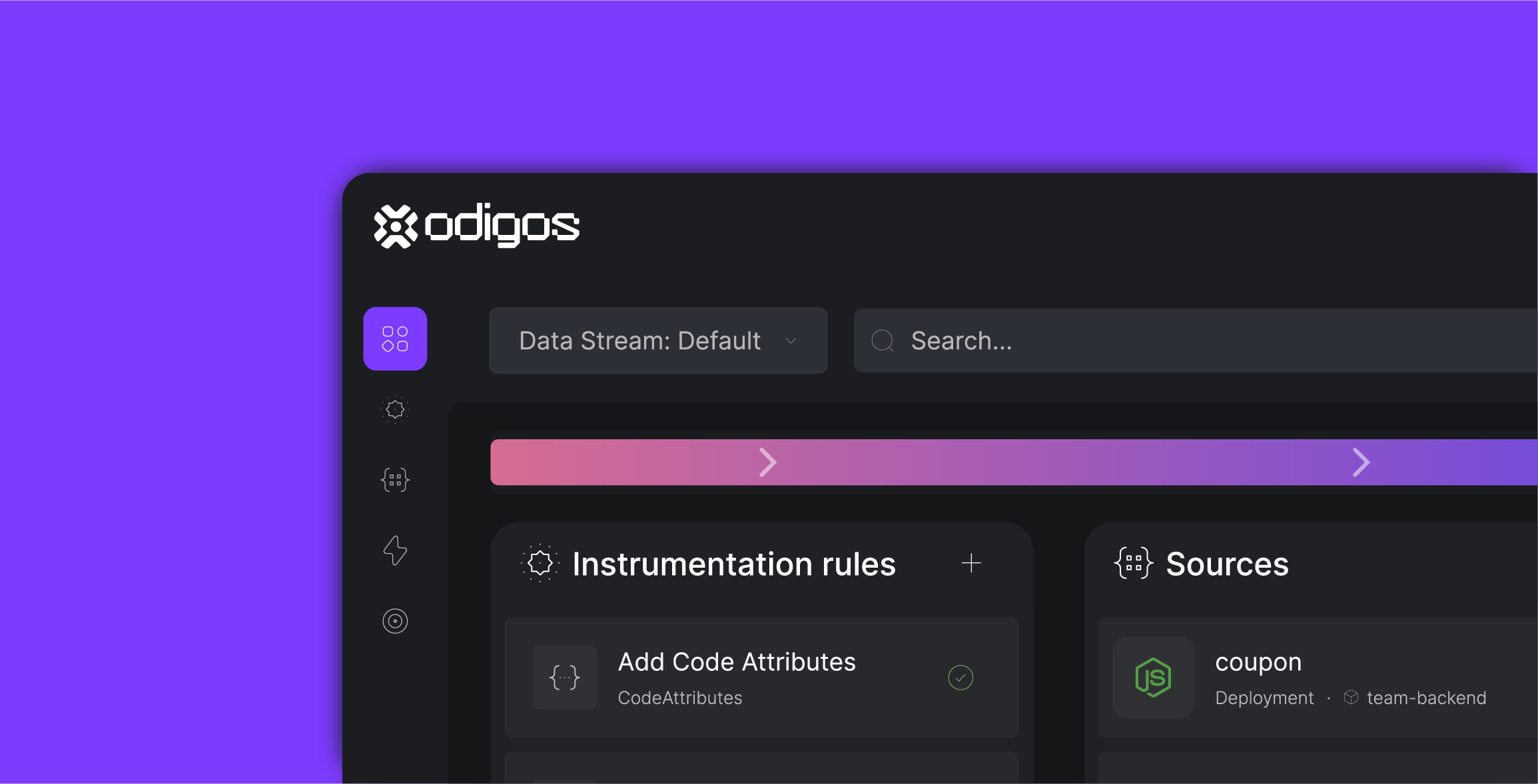
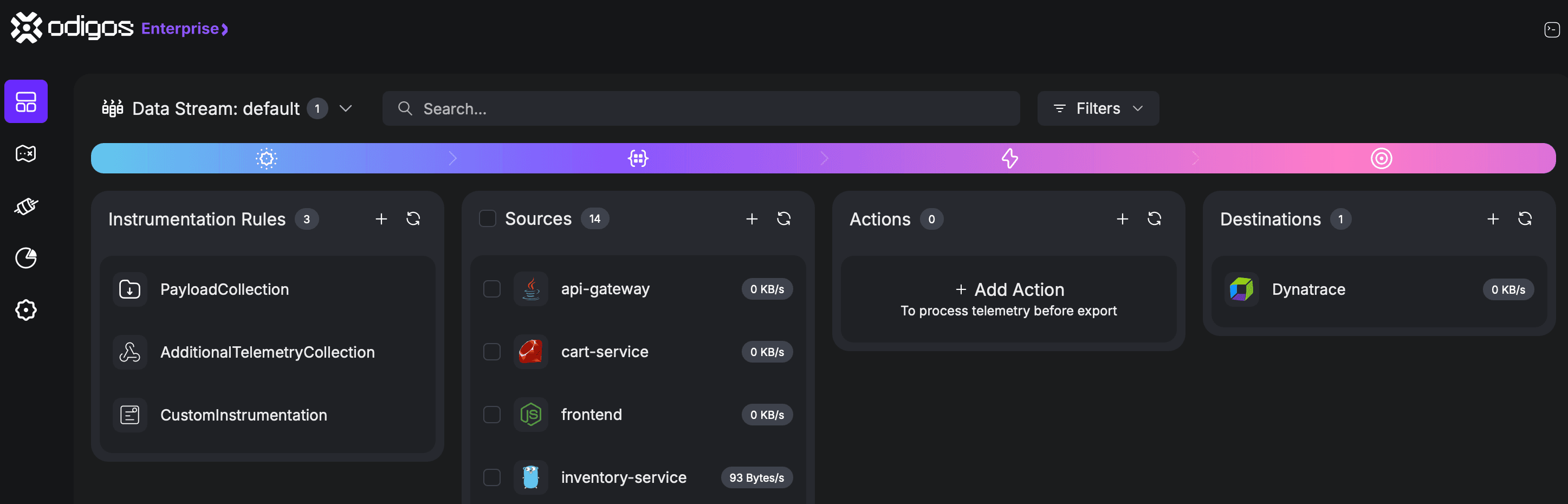
The interface embraces a refined dark mode, carefully tuned for the environments and workflows of modern engineers.
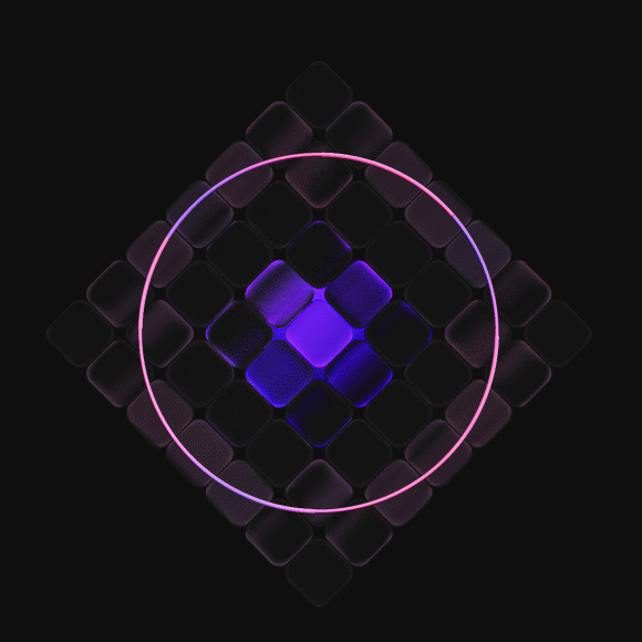
Colors are bold and deliberate, highlighting what truly matters while creating a clear distinction between critical, sensitive actions and those used less frequently.
The overall aesthetic is minimalist and distraction-free, built on a clean structure that visually separates the layers of interdependent features.
The result is a UI that feels both clear and powerful, a system that reflects the latest design and technology trends while maintaining functional precision.
We want users not only to interact with Odigos effortlessly, but also to enjoy the experience, where every pixel serves purpose, and every interaction feels intuitive.
You don’t just look at your observability data, you dive into it, navigating a kind of “telemetry metaverse” built from real data, in real time.
The design elements aren't just aesthetic. They are a direct visual metaphor for our mission:
to give users richer, clearer, and more actionable insight, from every angle and depth.
The Geometry Behind the New Logo
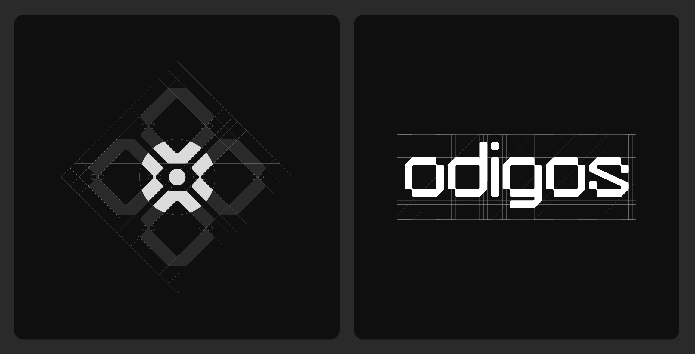
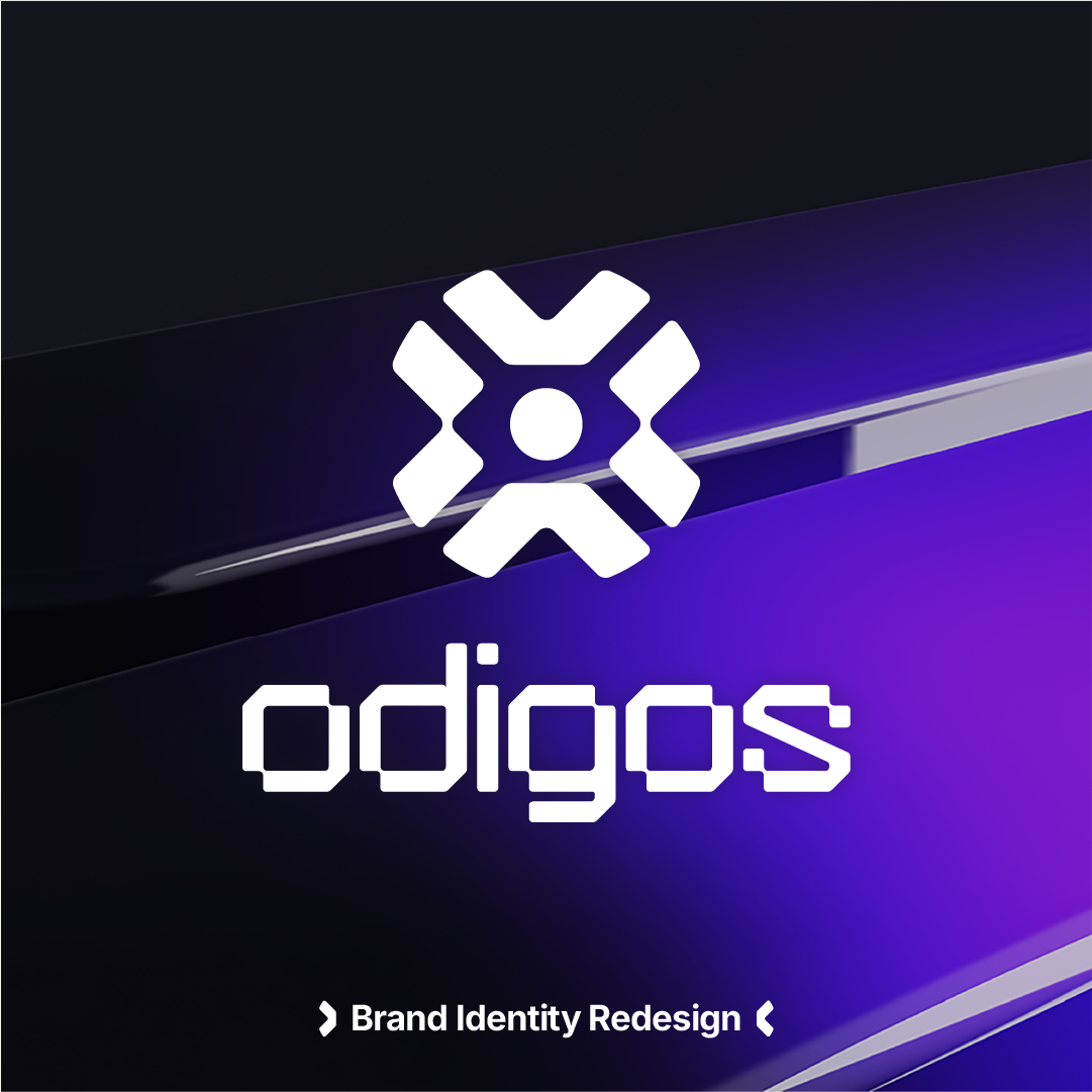
The new Odigos logo was born from precision and geometry, a grid of four intersecting squares forming the foundation of the mark. These four squares echo the four rounded letters in “Odigos,” (O.D.G.O) creating a seamless connection between the symbol and the wordmark.
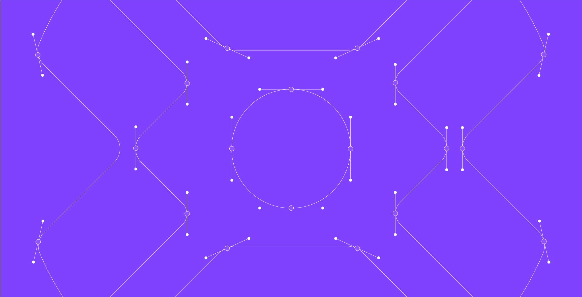
At the center sits a single black dot ‘the Nexus’ representing the focal point where everything converges. It’s both a watchful eye and a dynamic gateway, symbolizing how Odigos connects applications, clusters, and data streams into one cohesive view.
Each quadrant reflects an application or cluster, while the dot represents the central hub, the place where signals meet, insights form, and clarity emerges.
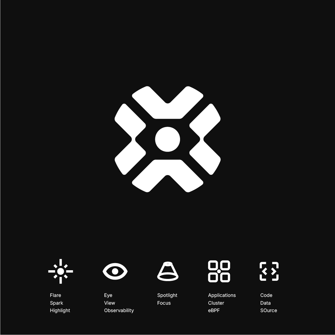
Alongside the symbol, we crafted a custom typeface built exclusively for the Odigos logo.
Its structure balances between square geometry with pixel-like precision and smooth, rounded flow, a visual bridge between retro arcade aesthetics and forward-looking modern design. This tension between sharp and soft, familiar and futuristic, captures the spirit of our brand and our users:
engineers who appreciate both the nostalgia of futuristic systems and the excitement of innovation.
The result is a logotype that feels technologic, authentic, timeless, and full of energy, a reflection of Odigos itself. It embodies the duality we strive for every day:
making observability feel approachable and familiar, yet bold and visionary.
That balance, between simplicity and sophistication, past and future, is exactly what drives how we design, build, and contribute to the world of technology.
Design That Reflects the Product
The new visual identity isn’t just a rebrand, it’s part of a complete Odigos redesign, spanning product, UX, and design system.
We’re rethinking the entire experience of observability:
how it looks, how it feels, and how it empowers engineers to think less about configuration and more about discovery.
The redesigned platform introduces:
- A simplified UX we take on the complexity of data collection and analysis, so users can focus on the signals that matter.
- A new UI language - cohesive, dimensional, and intuitive, reflecting the new Odigos visual world.
- A Next-Generation Design System - ensuring consistency, clarity, and scalability as we continue to grow the platform.
Our goal is simple: to make observability effortless.
Odigos absorbs the complexity, connecting, mapping, and visualizing telemetry automatically,
so users experience simplicity, clarity, control and confidence.
Connecting Design, Technology, and Purpose
At its heart, this redesign reflects the same principle that drives our technology:
Turning complexity into clarity.
Just as Odigos automatically captures telemetry (traces, metrics, etc.) across services and environments, our visual system correlates color, form, and motion into a unified experience.
The boundary between design and data fades, because in Odigos, every pixel represents purpose.
We’re not just observing systems; we’re revealing them.
The Future of Observability, Seen Differently
Odigos isn’t just evolving observability technology, we’re reshaping how it feels to explore your systems.
Our new brand and product design open a new dimension, one that’s immersive, intuitive, technologic and unmistakably human.
Because observability’s future isn’t flat data on a screen, It's a living landscape of depth and discovery.
Coming soon: the new Odigos experience
Get ready to explore a platform reimagined, with a new design system, a fresh visual identity, and a deeper way to see your data.
The journey begins here.
More from the blog.
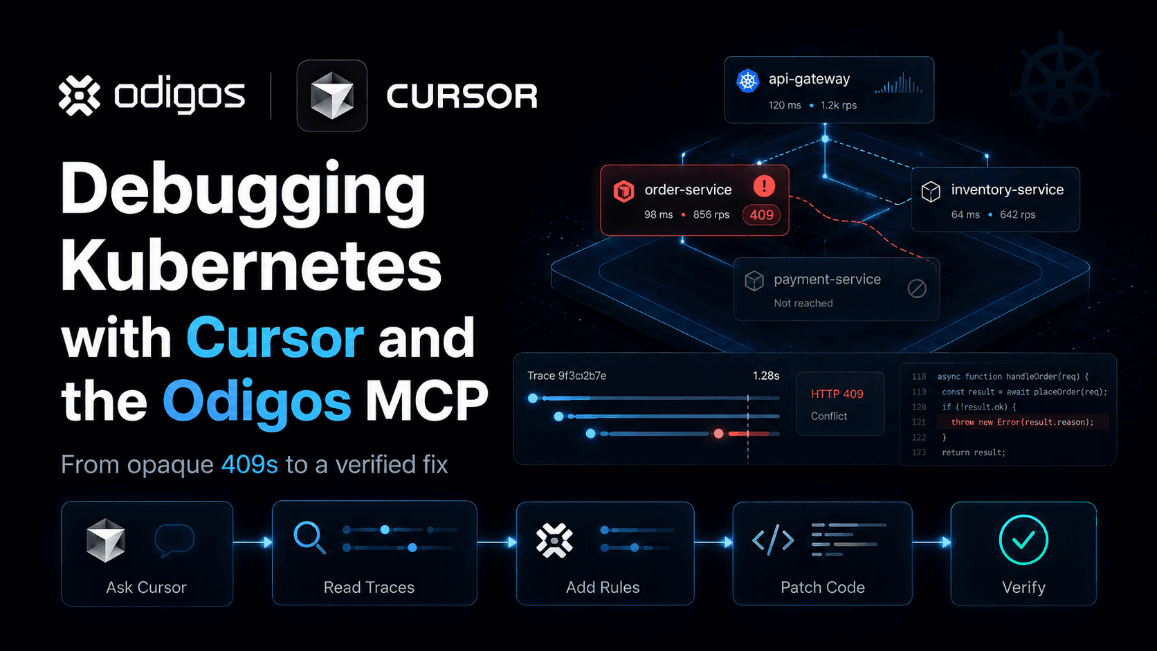
Stop guessing. Ask production.
One agent. One service. See how Odigos helps answer a production question.